
Methodology

Indicator logic, data processing, and score calculation

The Local Development Tracker turns geospatial, environmental, infrastructure, and planning data into comparable local-government indicators. This page explains how indicators are selected, processed, normalized, and aggregated into the Prosperity, Infrastructure, and Livability scores used throughout the app.

Overview

The methodology is designed for country replication. Each country keeps its own administrative labels and planning context, while the analytical logic stays consistent: collect local indicators, harmonize them to the relevant subnational units, convert them into comparable scores, and expose the results for maps, scatterplots, driver analysis, and planning review.

The framework is intentionally transparent. Users should be able to see the indicator source, understand how raw data becomes a score, and interpret the result as screening evidence for further validation.

Analytical architecture

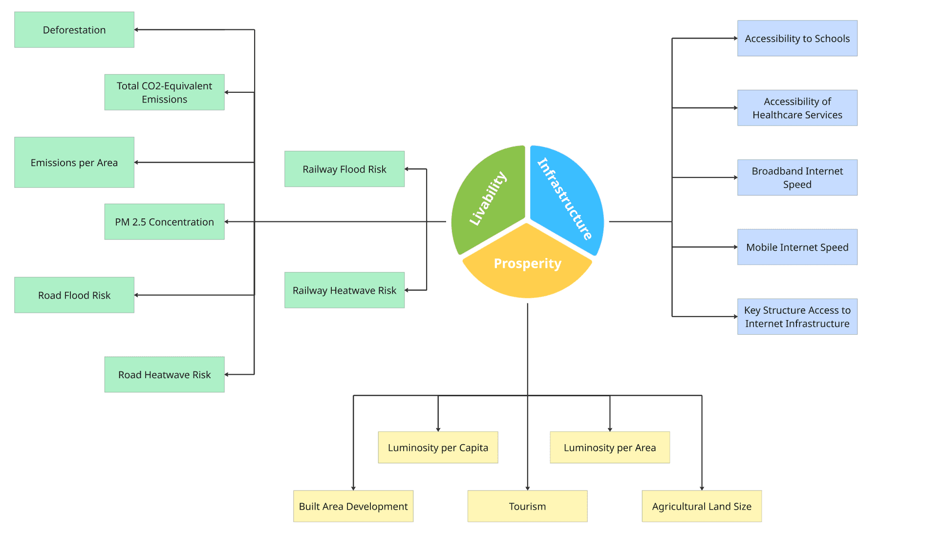
PIL framework diagram

The PIL framework organizes local development evidence around Prosperity, Infrastructure, and Livability. The diagram shows how indicator evidence can be connected to planning interpretation and investment prioritization.

PIL framework diagram linking local development indicators to planning and investment logic

Indicator Selection Logic

Indicators are selected to balance policy relevance with practical data coverage. The aim is not to include every possible local development measure, but to build a coherent evidence base that can be maintained and compared across local units.

  • Relevance to local development outcomes that can inform public investment and planning dialogue.
  • Availability at a subnational scale that can be harmonized across countries and administrative systems.
  • Ability to convert raw measures into comparable 0-100 score series with transparent interpretation.
  • Coverage across the Prosperity, Infrastructure, and Livability dimensions of the PIL framework.

Prosperity

Prosperity captures local economic activity, productive intensity, and development opportunity. In the current country releases, it draws heavily on nighttime luminosity, built-area development, tourism activity, and agriculture-related land signals where available.

  • Nighttime luminosity as a proxy for economic intensity and access to electricity-enabled activity.
  • Population- and area-normalized measures so dense urban centers and smaller local units can be compared more fairly.
  • Country-specific economic signals, such as tourism or agricultural land indicators, where they can be processed consistently.

Infrastructure

Infrastructure measures the availability and reach of systems that support local service delivery and connectivity. It combines digital access and service accessibility where those data are available.

  • Broadband and mobile internet performance.
  • Accessibility to schools, health facilities, and key local services.
  • Connectivity and access signals that help users compare service reach across local units.

Livability

Livability reflects environmental, climate-risk, and human-development conditions that shape daily life. The indicator set differs by country data availability, but it is designed to make environmental stress and quality-of-life signals visible at local scale.

  • Air quality and emissions indicators.
  • Road and railway exposure to flood, heat, and other climate-related hazards.
  • Land-cover, deforestation, or green-space signals where available.
  • Human-development conditions that complement infrastructure and prosperity scores.

Data Acquisition

The LDT combines scalable global datasets with country-specific sources where available. Each source is selected for its relevance to local development, spatial coverage, and ability to be processed into local-government units.

Satellite and environmental data

  • VIIRS nighttime lights for luminosity-based economic activity measures.
  • ERA5, OpenWeatherMaps, Climate Trace, and related climate or environmental datasets.
  • Dynamic World and other land-cover products for built-area, vegetation, and land-use signals.

Geospatial and infrastructure data

  • Administrative boundary files aligned to the relevant local-government tiers for each country.
  • WorldPop and other gridded population sources for population aggregation and normalization.
  • OpenStreetMap, Openrouteservice, WRI Aqueduct, and related spatial datasets for accessibility, transport, and risk measures.

Official and planning sources

  • National development plans, local strategies, budgets, and other planning documents where source links are available.
  • Official country data, partner data, and validated administrative references used to interpret local conditions.
  • Indicator metadata that records source provenance and interpretation notes for user review.

Preprocessing and Integration

Raw data are prepared before they are exposed in the app. The preprocessing pipeline converts heterogeneous input formats into consistent local-unit records that can be compared, mapped, and summarized.

Boundary reconciliation

Administrative names, identifiers, and geometries are harmonized so indicator tables, map boundaries, and planning-document records refer to the same local units.

Spatial aggregation

Raster, vector, network, and point datasets are aggregated to the relevant local-government level. Raster values are summarized within boundaries; point and network features are spatially joined or measured by coverage, access, or exposure.

Normalization

Indicators are normalized by population, area, or another appropriate denominator when raw totals would otherwise favor larger local units.

Temporal alignment

Input data are assigned to annual releases where possible. When countries have multi-year releases, the same local-unit keys are preserved so users can compare trends over time.

Score Calculation and Aggregation

Score calculation follows a simple interpretation rule: local units are compared against other local units in the same release, and higher scores indicate stronger relative performance for the selected indicator or pillar unless the metadata says otherwise.

  • Raw indicator values are transformed into comparable score values on a 0-100 scale, where higher values represent stronger relative performance for that indicator unless explicitly documented otherwise.
  • Component scores are grouped under Prosperity, Infrastructure, and Livability according to the PIL framework.
  • Pillar scores use transparent equal-weight aggregation across available component scores unless a country-specific methodology states otherwise.
  • Missing component values are not imputed inside the public app; they are skipped in aggregation where the prepared score tables identify them as missing.
  • Published score tables are treated as the authoritative score source for maps, scatterplots, driver charts, and country landing-page summaries.

Limitations and Interpretation

Data coverage

  • Not every indicator is available for every country, year, or local unit.
  • Open geospatial sources can be incomplete or unevenly updated across territories.
  • Planning-document coverage depends on whether source links are available and machine-readable.

Spatial interpretation

  • Local-government averages can hide neighborhood-level variation.
  • Boundary changes, naming differences, and language differences can affect matching quality.
  • Maps and scores should be read as screening evidence, not as a substitute for project appraisal.

Scoring interpretation

  • Equal weighting is transparent, but it may not reflect every sector priority or local policy preference.
  • A high score does not automatically mean a local unit has no investment needs; it indicates relative standing within the release.
  • Score results should be validated against local knowledge, sector diagnostics, and official planning processes.

References and Further Information

Indicator descriptions, source references, and interpretation notes are surfaced through the indicator metadata views in the analytics workspace. Users should read charts and scores as decision-support evidence for discussion, validation, and prioritization rather than as final project-selection decisions.